
UniTheme2 v4.20.1.a - v4.20.1.b update: implementing modern standards, improving performance
The scheduled update of the UniTheme2 design theme has been released — versions v4.20.1.a and v4.20.1.b. This version not only adds full technical compatibility with the CS-Cart 4.20.1 platform, but also introduces tools that will help elevate the visual perception of your online store or marketplace to the level of top e-commerce projects.
Below, we will detail each new feature, its business value, and provide exact configuration instructions for the administrator panel.
Interactive Block Titles (Extra block link settings)
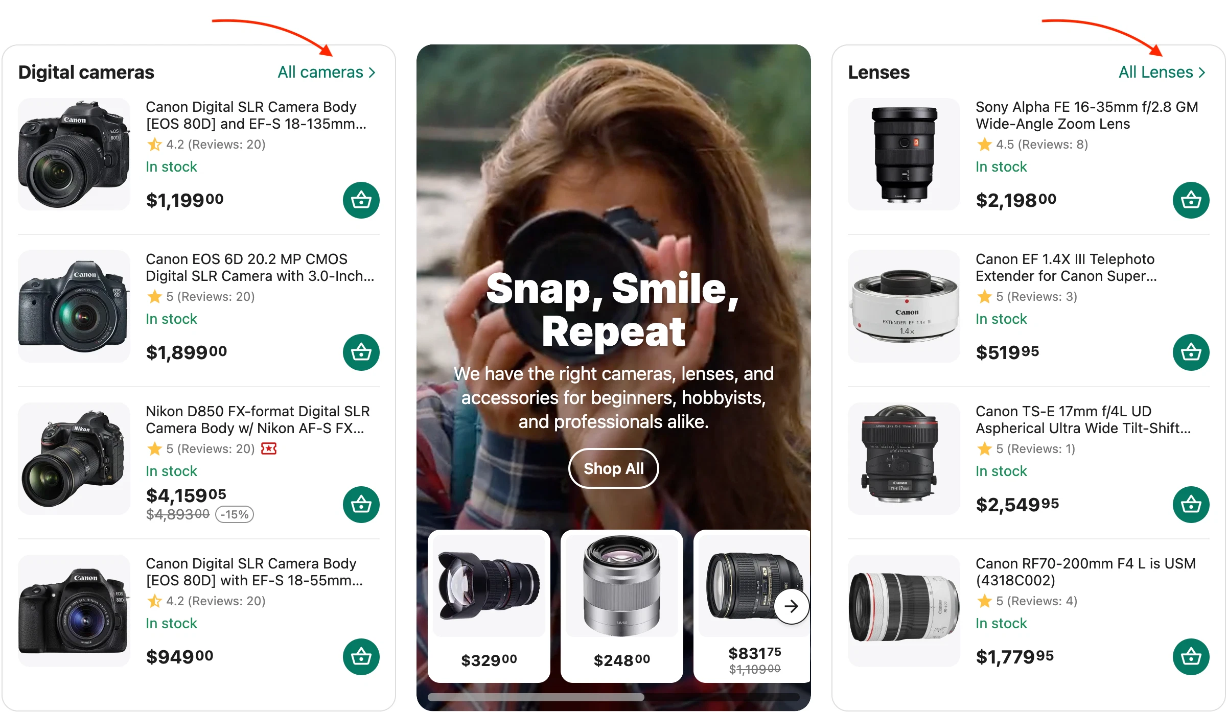
Block titles now have the capability to display clickable links and buttons with tooltips. By utilizing this functionality, you can nudge the buyer to progress down the funnel, improving the site's behavioral factors.
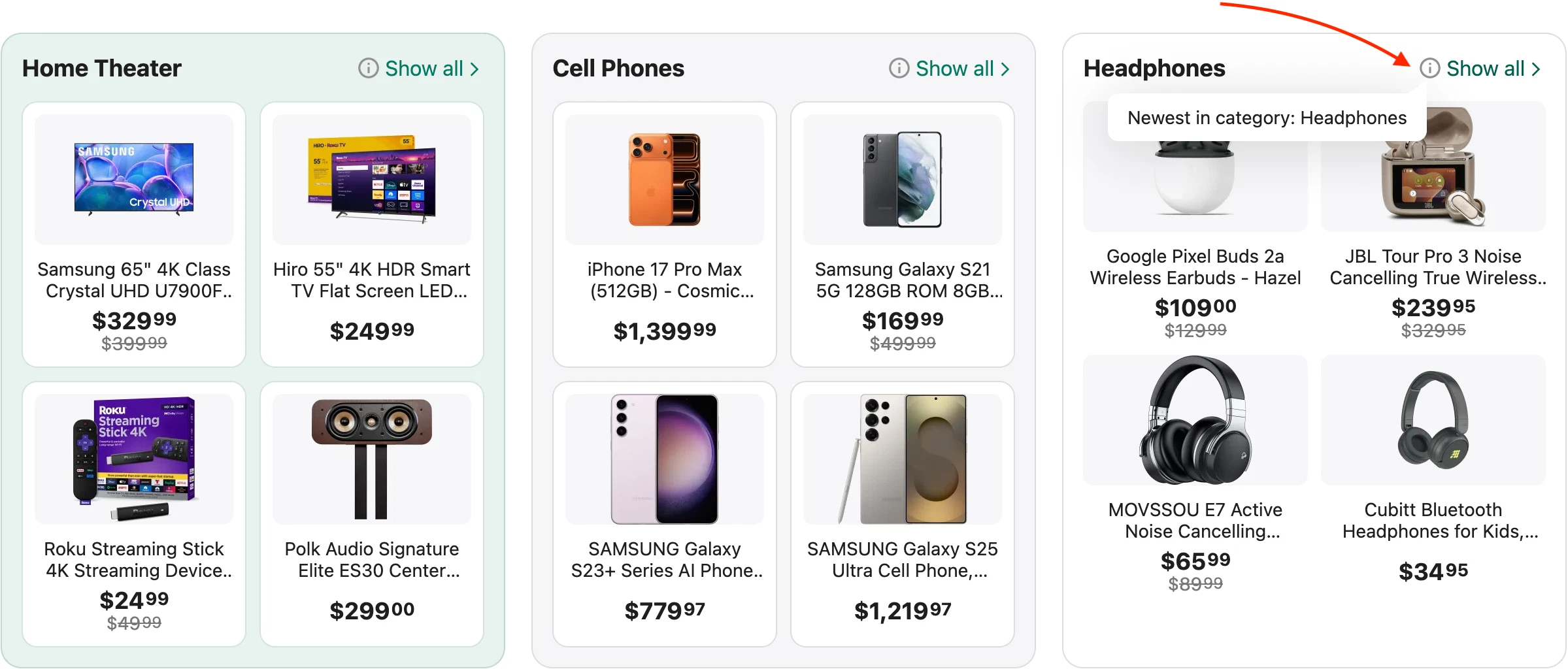
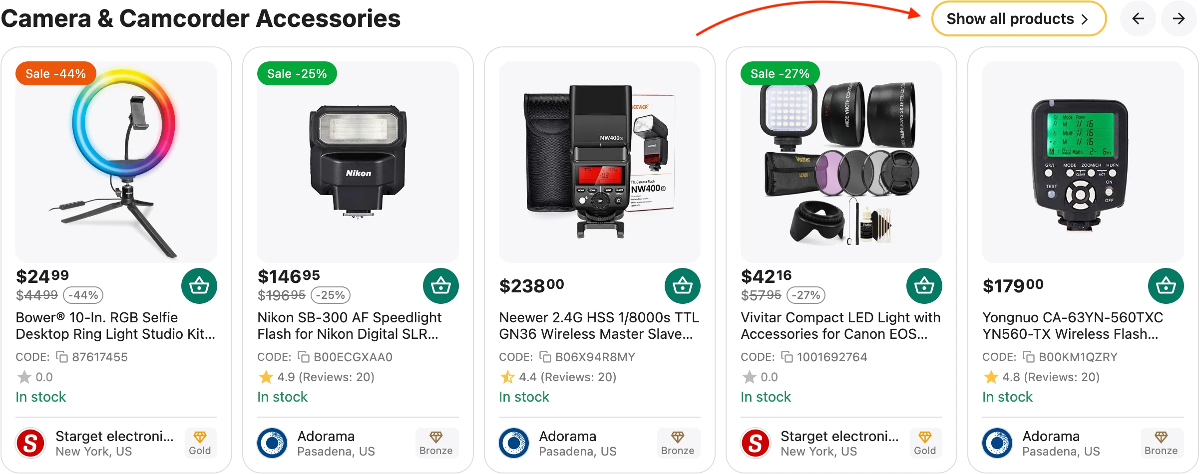
This is a tool for directly increasing conversion rates and building effective internal linking for an online store. You can direct the buyer straight from a product block to the desired category with a pre-configured filter, a blog article review, or a promotion page. The buyer moves down the funnel faster, improving the site's behavioral factors.
Possible Application Scenarios (Business Cases):
1. Increasing Sale Efficiency
How it was before: You display a "Promo Offers" product block on the homepage. The buyer sees 4-5 products, but to view the entire list of discounts, they must return to the main menu and search for the "Sales" section.
How to configure now: A "View all discounts %" button is created in the product block title, leading to the page of a specific promotion. The tooltip can state: "More than 500 discounted items until the end of the week!".
Result: Direct redirection of "warm" traffic from casual browsing to the target sale page.
2. Smart cross-sell and ready-made solutions
How it was before: In a "Popular Laptops" block, the user sees product cards. If they need a specific brand or parameters, they leave to search for them via the main catalog.
How to configure now: For the "Apple Laptops" block, a "Find Accessories" link is added to the title, which leads to the "Cases and Bags" category with a filter pre-configured in the URL for a 13-14 inch diagonal. In the tooltip, we write: "Original cases and cables for selected models."
Result: Growth of the Average Order Value (AOV) due to the instant offering of related products in one click.
3. Addressing Objections and Expert Sales
How it was before: A block with complex equipment or cosmetics simply shows products. The buyer hesitates about their choice and closes the tab to read reviews online.
How to configure now: In the title of the "Sport Smartwatches" block, a "How to choose? Read guide" link is displayed, leading to an expert article in your store's blog. The interactive tooltip states: "Breakdown of 10 key features and comparison of autonomy in our review."
Result: User retention on the website, growth of trust in the store, and reduction of the bounce rate (Bounce Rate) due to high-quality internal content.
4. Increasing Brand Loyalty
How it was before: A "Products by Xiaomi" block is displayed on the homepage or product page. The buyer is interested in the manufacturer, but to view the brand's entire range, they have to search for the brand page link in features or via search.
How to configure now: A "All Xiaomi Brand Products" button is displayed in the block title, leading to the dedicated vendor page. The tooltip can state: "Official warranty and more than 300 models in stock."
Result: Fast navigation for fans of specific brands and improved indexing of brand pages by search engine robots due to direct sitewide linking.
5. Seasonal Marketing without Structure Redesign
How it was before: A season arrives (for example, back to school or tire change). Marketers have to create new temporary categories, manually assign products there, and after the season — delete them, risking SEO 404 errors.
How to configure now: You display a "Getting Ready for Summer" block on the homepage and add a "View full summer collection" link to the title, which leads to the general clothing category but with a filter pre-configured in the URL (for example, ?features_hash=season-summer). In the tooltip, we write: "New arrivals every week!".
Result: Instant launch of seasonal sales and selections without changing the catalog structure and without harming the site's SEO architecture.
6. Uncluttering the Homepage
How it was before: To demonstrate the diversity of the assortment, administrators are forced to spawn huge product grids on the homepage, which slows down the site and confuses the buyer.
How to configure now: You display a compact block (just 3-4 top products from the "Power Tools" category) and place a prominent "Go to tools catalog" button in the title.
Result: A visually clean, tidy homepage without losing clickability and transitions to internal categories.
How to configure:
(Settings are applied if the block uses special wrappers with the prefix "AB:", except for the "AB: Block: Title" template)
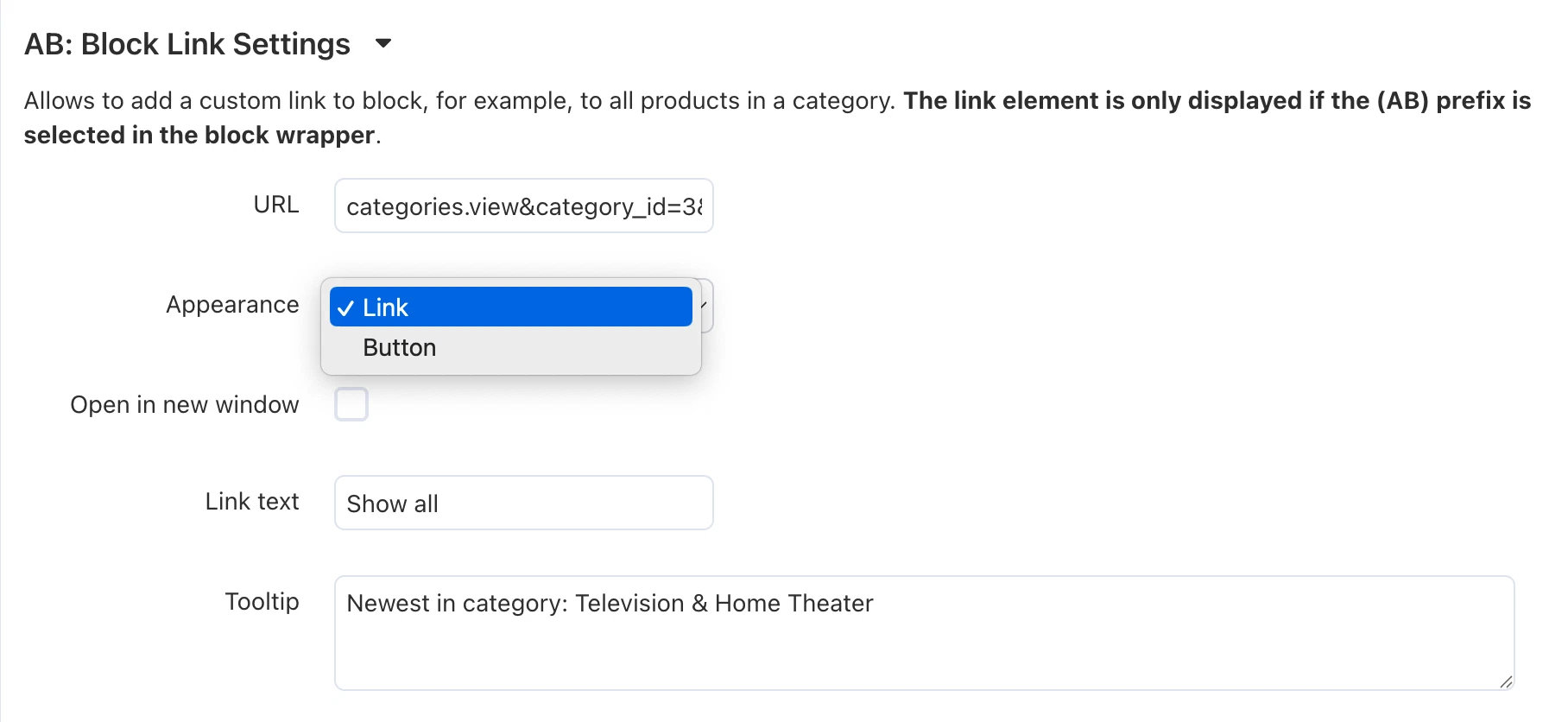
- Go to "Design → Layouts" and open the parameters of the desired block.
- In the "General" tab, ensure that one of the wrappers is selected: "AB: Main block (SEO)", "AB: Simplified block", "AB: Secondary block (with or without border)", or "AB: Dropdown list on click".
- Go to the "Block settings (Extra block link settings)" tab and fill in the fields:
- "URL" — specify the target page link.
- "Appearance" — select the visual styling: "Button" or "Link".
- "Open link in a new window" — "In the current window" or "In a new window".
- "Link text" — specify the name (multilingual field).
- "Tooltip" — enter the tooltip text.
Native Mobile Gallery Scroller
For smartphones, a completely new type of product gallery display has been added — "Native Scroller". Images are scrolled with a horizontal swipe from edge to edge of the window, while a fragment of the neighboring photo is always visible to the buyer (the first and last frames maintain a neat technical padding).
How it works under the hood (CSS vs JS):
The basic mobile slider in CS-Cart (OWL Carousel) constantly recalculates gesture coordinates via JavaScript with every finger movement. This causes interface micro-stutters (Layout Shifts) and loads the phone's CPU.
"Native Scroller" in UniTheme2 is implemented on pure CSS. The smartphone browser processes such scrolling at the graphics processing unit (GPU) level, which yields a solid 60-120 FPS during scrolling.
Influence on Core Web Vitals (SEO effect):
The absence of JS initialization of the gallery during the page load phase dramatically improves TBT (Total Blocking Time) and INP (Interaction to Next Paint) metrics. The product card becomes interactive instantly, and search engine robots record perfect interface responsiveness.
How to configure:
- Go to "Add-ons → Downloaded add-ons → AB: UniTheme2 → Theme settings".
- Open the "Product" tab.
- In the "General and additional settings" section, find the item "Image gallery appearance".
- Select the "Native Scroller" option for smartphones.
Recommendation for UX: Set the product image width for smartphones to around "230px" (the "Product image width" setting in the same section). This will provide an ideal visual cue of the next frame's presence.
The mobile version of your store now works according to the patterns of native apps (like Wildberries or Ozon). The mechanism is implemented at the CSS property level without using heavy JavaScript scripts (buttons and counters). This dramatically reduces the load on the device, eliminates rendering delays, and directly boosts performance scores in Google PageSpeed.
New Variation Display Format
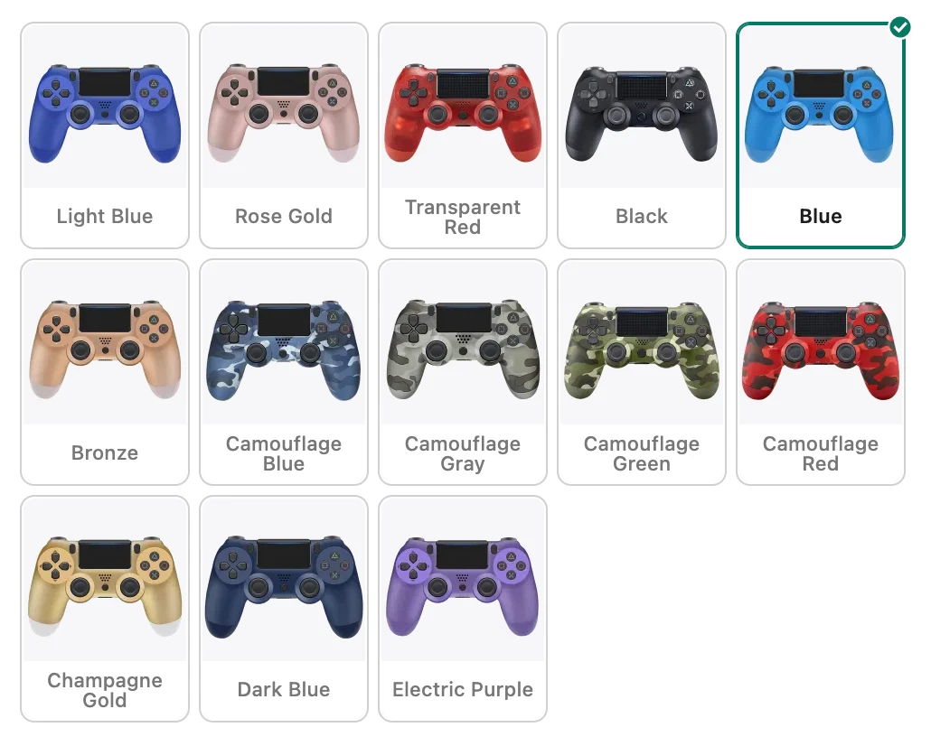
New styling of variations based on features with the "Images" type, the "Product Combinations" module, and a single-column list of features on the product page.
Previously, such variations were displayed as simple small icons without labels, and when there were many variants, they chaotically stretched the page. Now, this block has become neat, modern, and far more informative.
Main Functional Benefit for the Buyer:
- Clarity and mistake-free choice: Each tile now combines a product image and its text name (for example, "Light Blue", "Camouflage Gray"). The buyer immediately understands exactly which option is in front of them.
- Quick "try-on": on hover, the image in the main gallery is instantly swapped to the corresponding variant. This allows users to quickly evaluate the appearance of all variants on the fly.
- Transitioning to the variation and highlighting the active element on click.
Tidy Interface and Overflow Protection:
- Compact scroller instead of chaos: If a product has many variants with the "Images" type (which previously could form a huge sheet of thumbnails), the block's height is automatically limited. If the variants do not fit in a single line, a scroller is activated, along with a "Show all" link that opens the full list.
- This keeps the product card structure clean and clear, even if the product has a massive assortment of modifications.
Advanced Settings for "Link View" Compact Lists
For product blocks with the "Link View" template, advanced individual display parameters have been added.
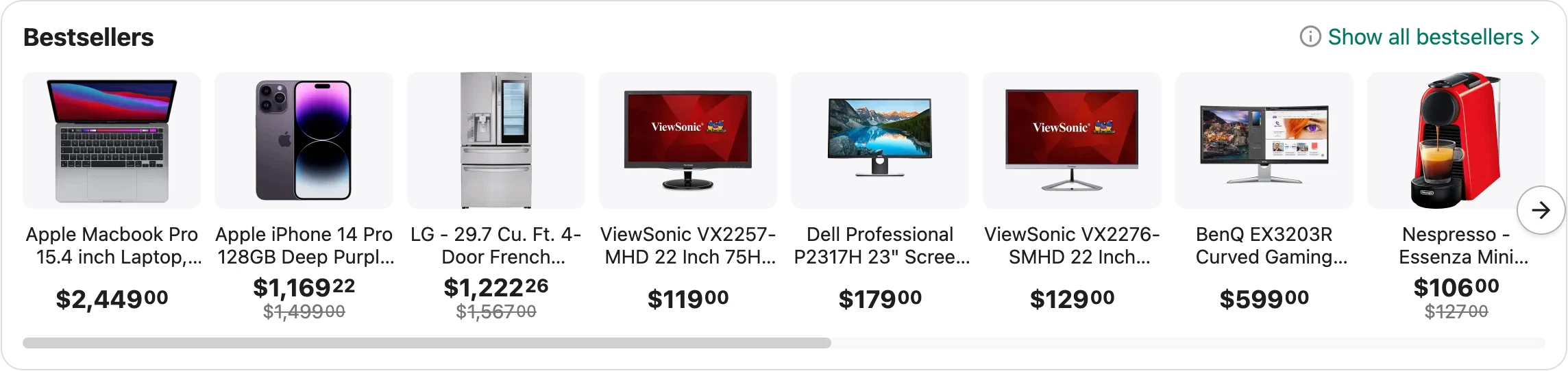
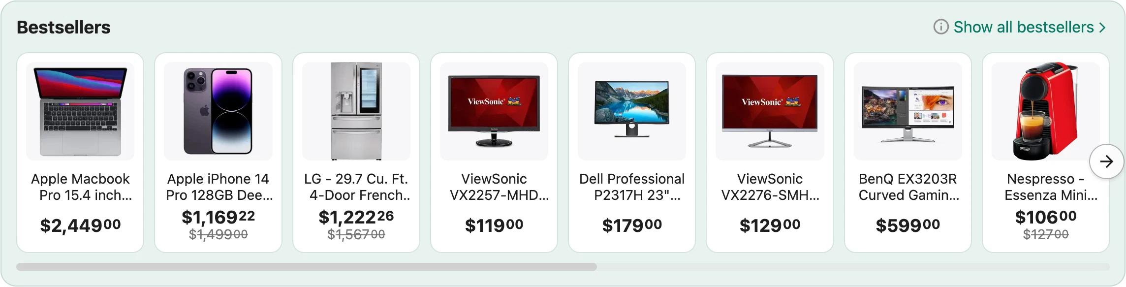
The "Link View" template is indispensable for linking, recommendations, and cross-sell blocks (cross-sell). Separate management of element dimensions allows you to organically fit this adaptive online store design into sidebars or footers, making offers noticeable but not overwhelming to the interface.
How to configure:
- In layouts, open the parameters of a product block that has the "Link View" template selected.
- In the "Block settings (Extra settings)" tab, the following fields are available:
- "AB: Icon width" — allows setting thumbnail dimensions.
- "AB: Icon height" — allows setting thumbnail dimensions.
- "AB: Columns per row" — sets the maximum number of columns in the grid.
- "AB: Scroller" — enables horizontal scrolling mode for the block.
CS-Cart SEO Optimization: Category Description Code Management
A new option has been introduced, allowing you to manage the positioning of the SEO text in the HTML markup of the catalog page.
Outputting the category description HTML code above the product grid (in the DOM tree) allows search engine robots (Google, Yahoo, etc.) to read relevant text content faster, which is critical for ranking. Meanwhile, visually for the user, the text can remain at the bottom.
How to configure:
- Go to "Add-ons → Downloaded add-ons → AB: UniTheme2 → Theme settings".
- Go to the "Category" section.
- Activate the setting: "Place the category description HTML code above the product block".
In combination with the "Antibot" module, which in the new release closed cyclical links to reviews and brands in lists and on the product page from indexing, the template becomes more optimal in terms of saving crawling budget.
Search by Feature Variants in the Administrator Panel
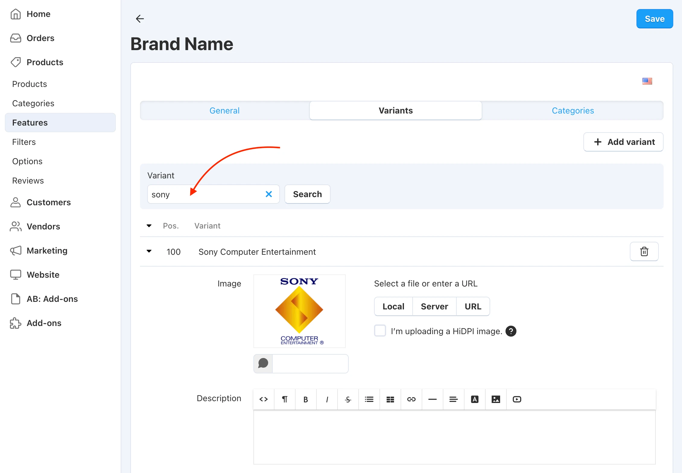
The update adds a long-awaited tool for administrators and content managers — a search bar for variants directly on the feature editing page. This functionality fundamentally changes the process of managing global features with large datasets (such as "Brand", "Manufacturer", "Material", etc.).
What was the administrator's main "pain":
Previously, editing popular features turned into a routine. If a store had hundreds or thousands of brands, to change a logo, add a banner, or edit the SEO description of a specific trademark (for example, Sony), the administrator had to:
- Manually scroll through dozens or hundreds of pagination pages deep.
- Peer into the lists on each page, trying to find the desired position.
- Waste a massive amount of time on empty clicks and waiting for pages to load.
How it works now:
- Now, simply go to the "Variants" tab, enter the name of the desired brand into the search bar, and click the "Search" button. The system will instantly filter the list and output the searched position.
- Radical acceleration of administration: The process that previously could take a significant amount of monotonous searching is now done in 2 seconds. The content manager can get straight to work: upload the current logo, write the description, or change the positioning of the element.
Optimization and Visual Changes
The UniTheme2 template interface continues to improve for the convenience of users and content managers.
- Multiple adaptations and optimizations of the template's styles have been made to increase performance.
- For all scroller types, responsiveness has been improved and spacing has been standardized for all border and wrapper types.
- The display and smoothness of behavior when opening/closing sticky panels and modal windows have been optimized.
- Above the regular website header, sections with any custom content (for example, sitewide graphical promo banners or sale informers) can now be displayed.
- In blocks with the "Account" template, a visual icon with the initials of the authorized user is now automatically displayed.
- In the latest posts block with a two-column layout, the first element now automatically stretches to full width if the total number of elements is odd. This creates a correct visual emphasis on fresh content.
- On the banner editing page, the current interface language is now strictly considered when entering preview mode.
- The behavior and styling of sections with user-defined classes that help further format the section appearance have been systematized:
ut2-gray-box, ut2-border-box, ut2-color-box, ut2-second-color-box.