The most important Unitheme changes in 2025
Version 4.18.3.a
New features and improvements:
[+] On the banner list page "Marketing → Banners", a "Clone banner" option has been added, allowing you to duplicate banners.
Read more in the documentation section.
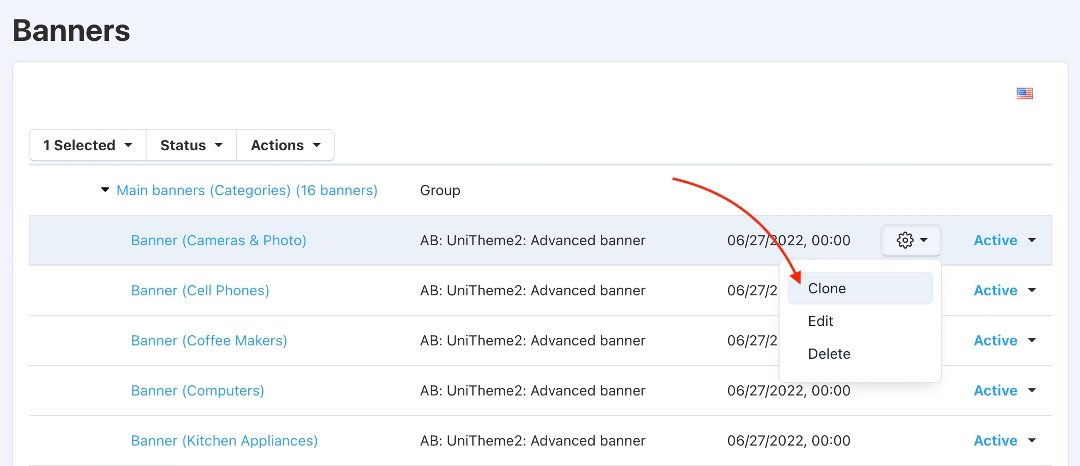
Why this is needed: This feature significantly saves the content manager's time. Instead of creating similar banners from scratch (e.g., for seasonal sales or A/B testing), you can copy a ready-made layout with one click and make only minimal edits. This speeds up the launch of marketing campaigns and reduces the likelihood of configuration errors.
[+] On the banner list page "Marketing → Banners", an "Add Banner Group" option has been added, allowing you to group banners together. In the banner settings, you can select which group it belongs to. Additionally, when adding a banner to a block, searching for banners by group is now available.
Read more in the documentation section.
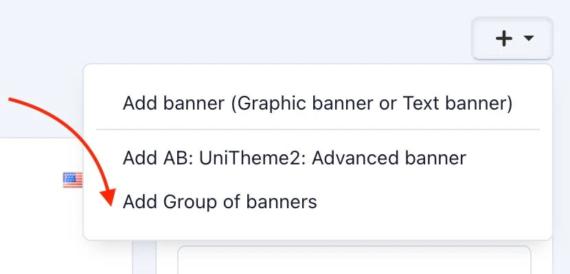
Why this is needed: When you have dozens or hundreds of banners, managing them becomes difficult. Grouping allows you to structure marketing materials by campaigns, seasons, or categories. This simplifies navigation in the admin panel, makes finding the right creative easier, and allows you to quickly assign the necessary banners to the appropriate blocks on the storefront. Order in the admin panel = speed in work.
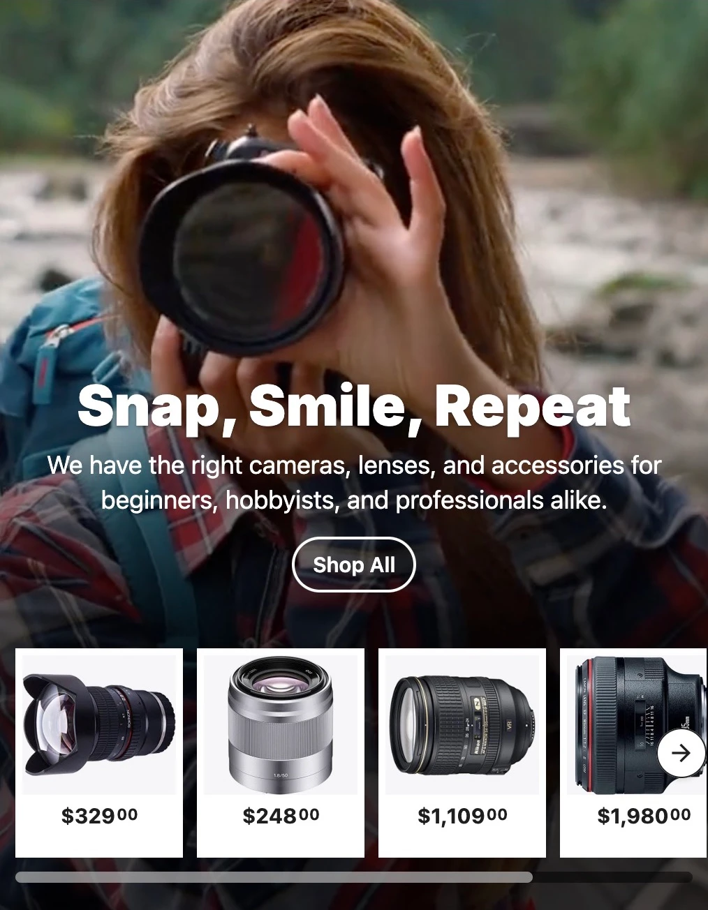
[+] In the advanced banner, the ability to display products inside has been added: "Object inside (Image, Video, Products) → Displayed object → Products". Three product display templates are available: Grid, Small items, Thumbnails.
Read more in the documentation section.
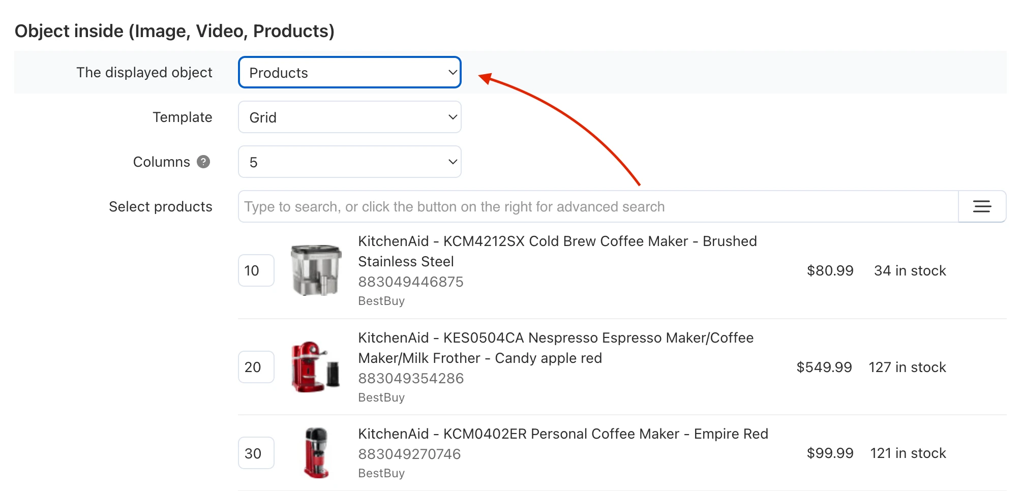
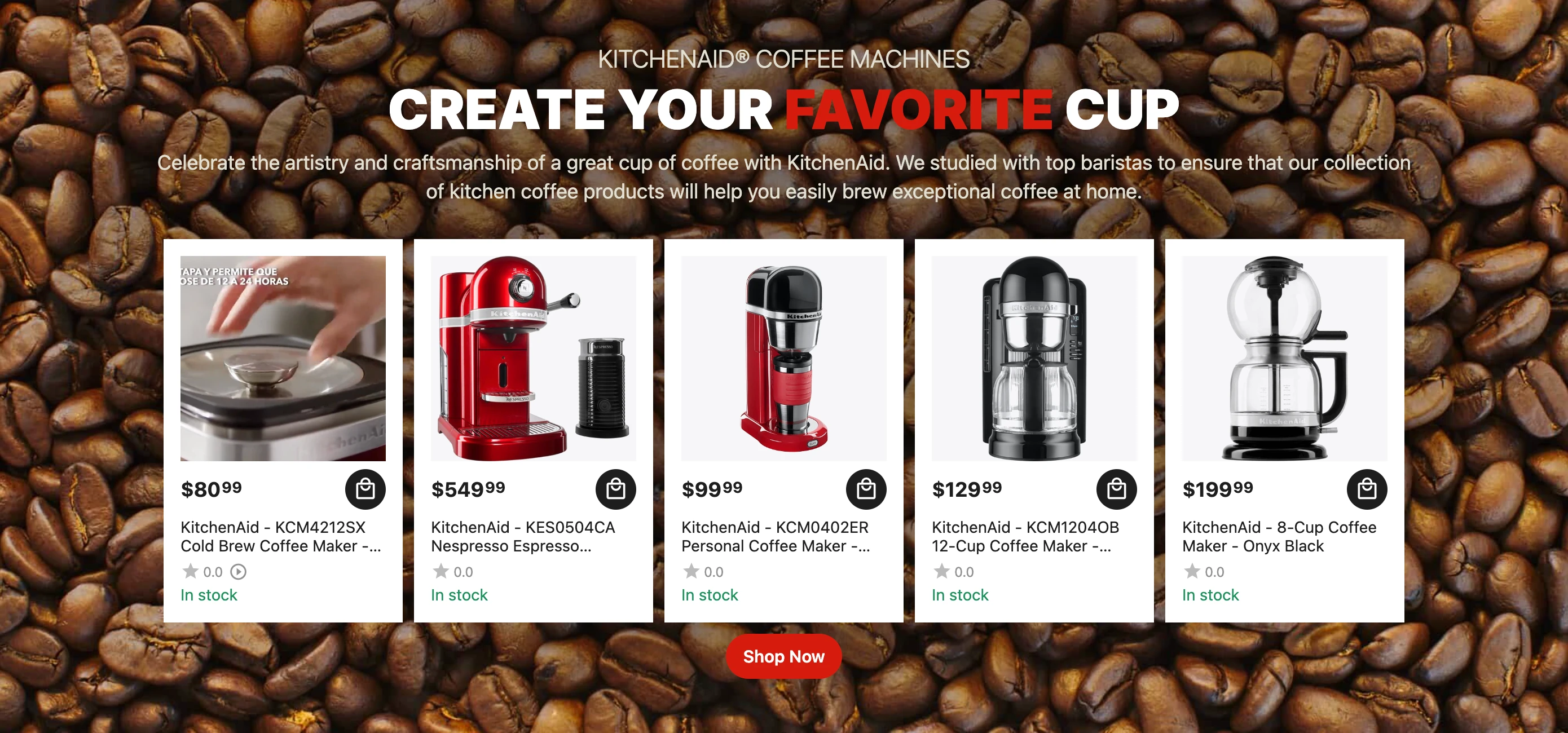
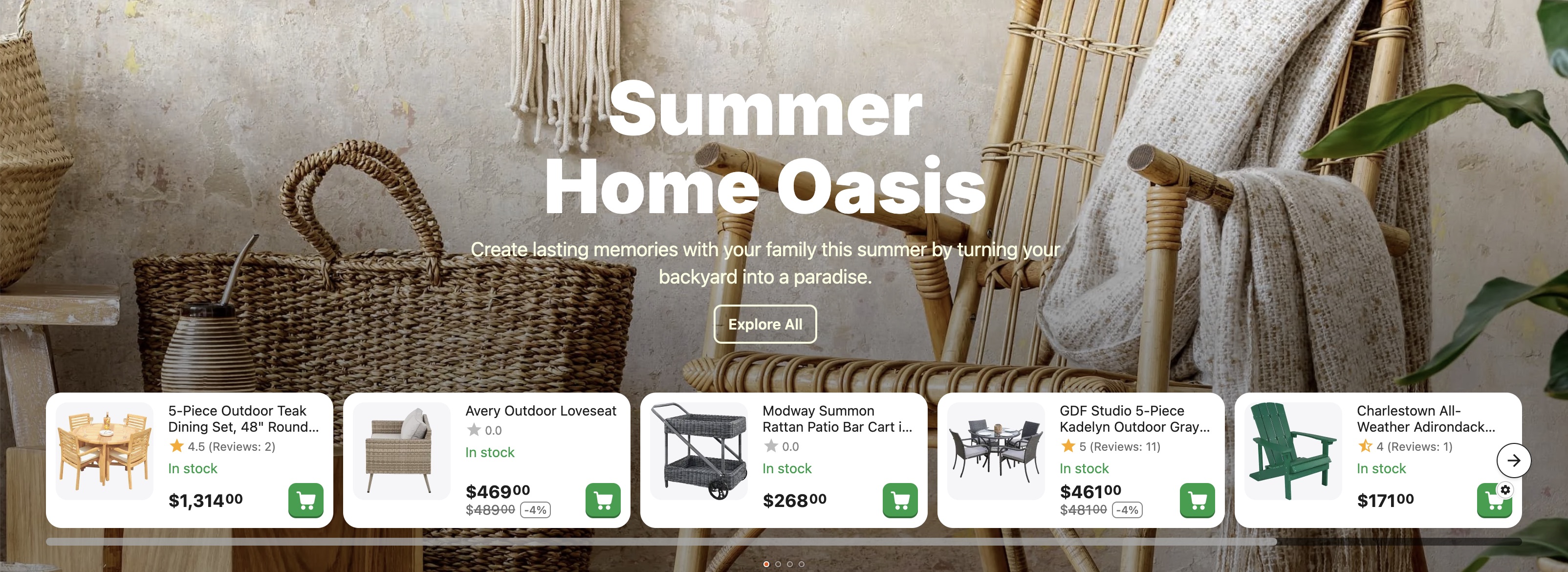
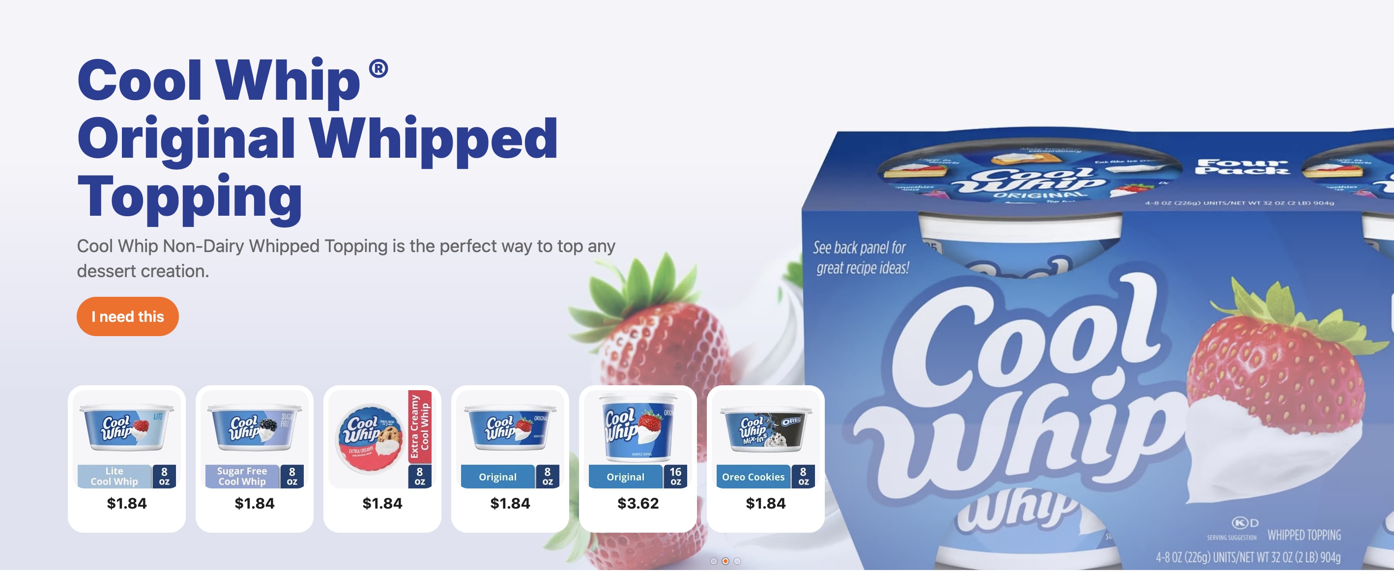
Why this is needed: This is a powerful tool for increasing conversion. You aren't just showing a beautiful picture, but immediately giving the opportunity to buy the product "from the cover". This shortens the user's path from "saw it" to "bought it", as transitions to the product page happen directly from the promo block. Ideal for Lookbooks or "Product of the Week" collections.
[+] Banner preview capability has been added to advanced banners. Now you can view the banner without placing it in a layout block.
Read more in the documentation section.
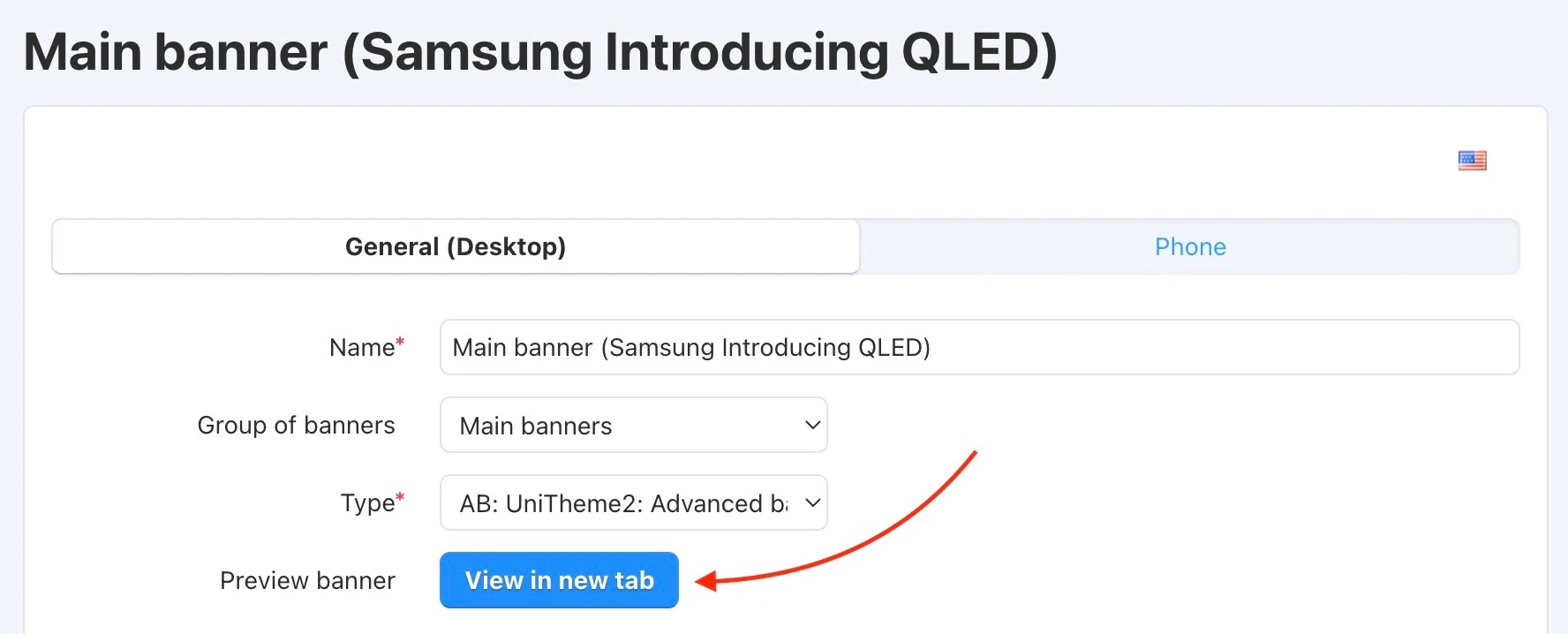
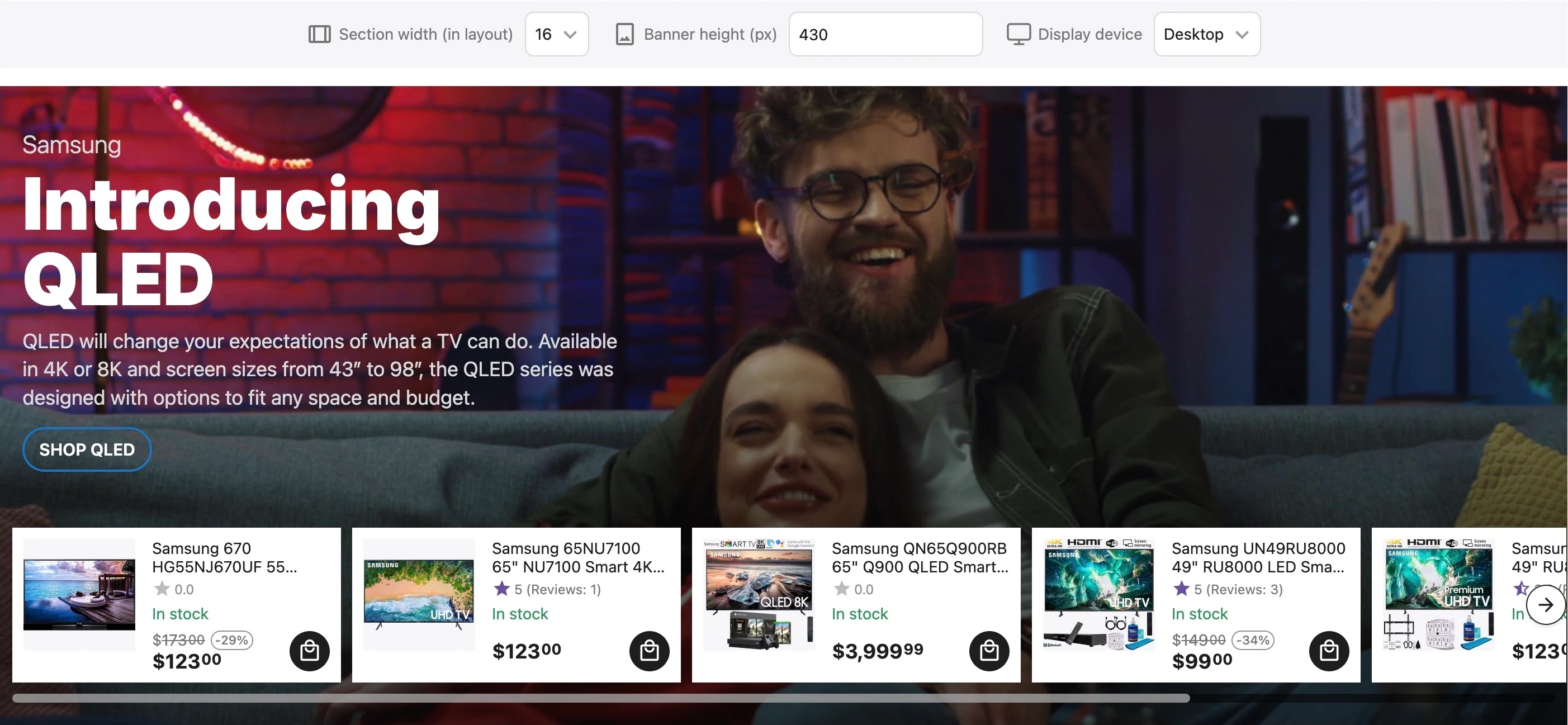
Why this is needed: "Measure twice, cut once." The preview function allows you to see how the banner will look in reality without publishing it on the site. You avoid situations where visitors see broken layouts or poorly cropped images. This guarantees the visual quality of your store before launching promotions.
[+] In advanced banners, for masks of the type "Add mask → Semitransparent (smooth darkening)", a "Dimming direction" setting has been added. This setting allows you to manually specify the direction for the mask from the darkened color to full transparency.
Read more in the documentation section.
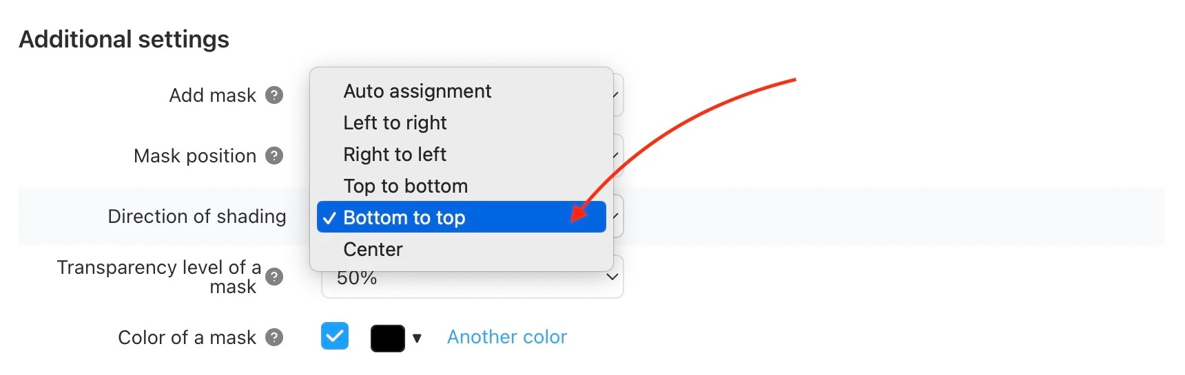
Why this is needed: Design is in the details. The ability to control the dimming gradient allows you to perfectly fit text over a complex background. You can darken only the part of the image where the text is located, leaving the rest of the picture bright and attractive. This improves the readability of the offer without sacrificing the beauty of the banner.
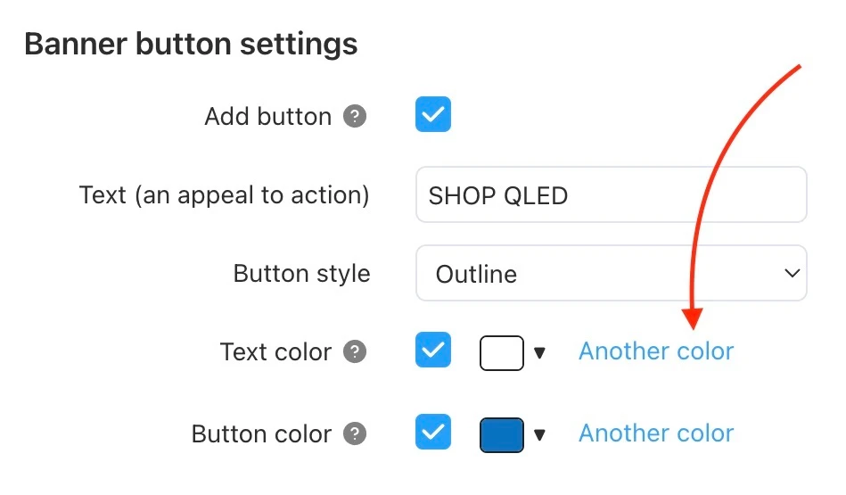
[+] In advanced banners, for all mask types (location "Additional banner settings → Add mask"), the ability to choose the mask color taking transparency into account has been added.
Read more in the documentation section.
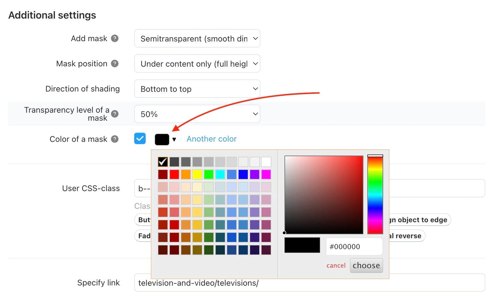
Why this is needed: Full control over corporate identity. You can overlay not just black or white shadows, but colored filters that match your brand tone. This allows you to create a unique atmosphere on the site and make banners more emotional and suited to the overall color scheme of the store.
Changes to existing functionality:
[*] Added the ability to immediately upload images or video when creating an advanced banner. Previously, this was only available after saving the banner.
[*] In the advanced banner settings, changes have been made for ease of use:
- The field with internal padding has been split into several fields for filling each side separately
- A link to an external resource with a convenient color picker has been added to the color fields
- New presets have been added
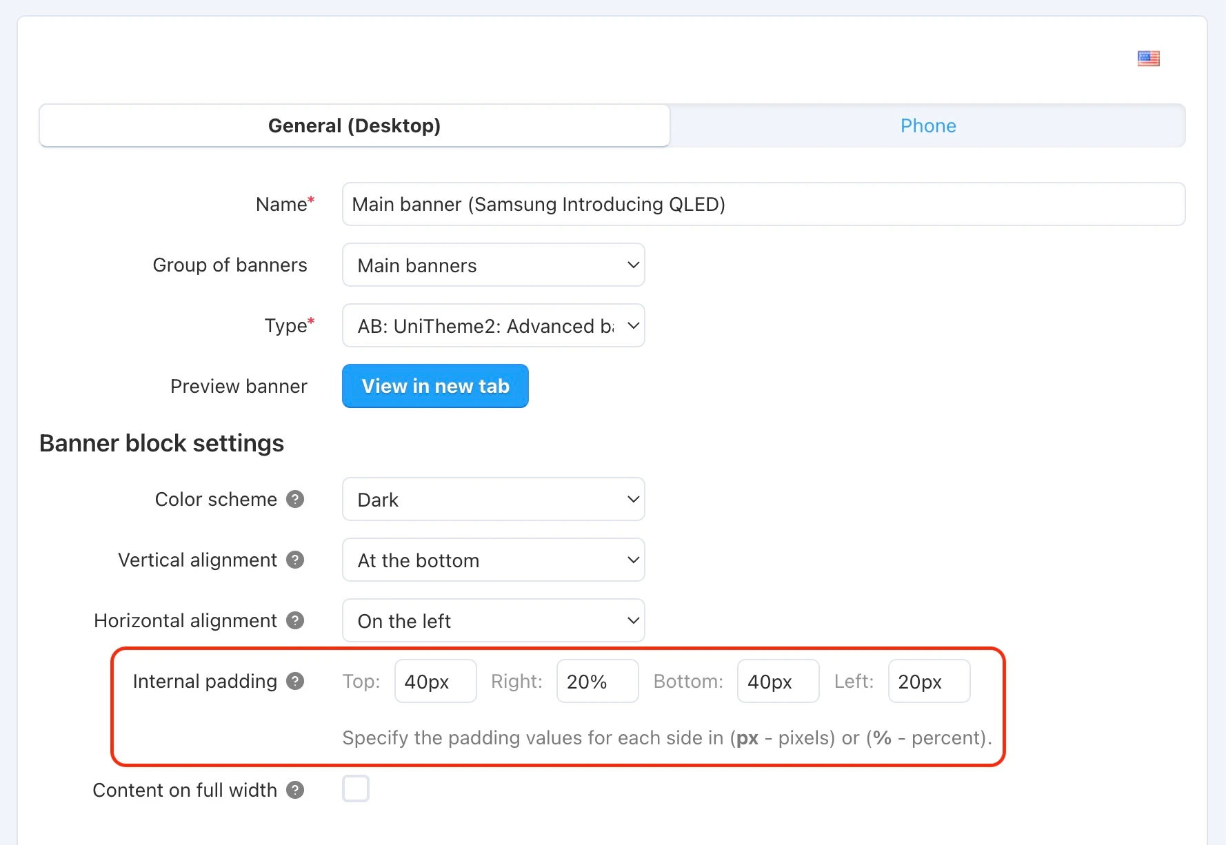
Why this is needed: This is about convenience and flexibility. Separate padding settings and built-in color selection tools allow you to create professional-looking banners without involving a designer or developer. You get pixel-perfect results using the administrative panel tools.
[*] Navigation arrows have been added for the product list with the "AB: Lightweight scroller" template.
[*] Navigation arrows have been added for the banner block with the "AB: Advanced banner (multiple banners in a row)" template with the navigation type "Native scroller".
[*] A new layout type has been added for the blog article block with the "AB: Blog: Recent posts" template.

Why this is needed: Content marketing only works if it is read. The new, more attractive design of the article block increases the click-through rate of materials. This helps keep the user on the site, improves SEO behavioral factors, and broadcasts the expertise of your store.
Version 4.18.3.b
New features and improvements:
[+] The sticky panel with filters and categories is now available for all devices. Its display can be managed in the theme settings in the "Category" section via the option "Enable sticky panel with 'Categories' and 'Filters' buttons" for desktop and tablet views. The display of horizontal filters has been changed: they now appear in a single row with a scroll and navigation arrows, which appear if the filter buttons do not fit into the available block area.
Read more in the documentation section.

Why this is needed: Improved navigation (UX). When a user scrolls down the page, the menu with categories and filters remains at hand. This eliminates the need to scroll back up to refine the search. Result: it is more convenient for customers to use the catalog, they view more products, which directly affects sales growth.
[+] In the category list block "Categories/Refine Category", settings have been added: Show number of products in category, Limit number of categories for the second level, Limit number of categories for the third level. These settings allow you to limit the output of subcategories in the list and show the number of products in each category.
Read more in the documentation section.

Why this is needed: Reducing cognitive load. Huge lists of subcategories are intimidating and scatter attention. Limiting the output and showing the number of products helps make the menu tidy and informative. The client immediately sees the structure and understands where to look for the desired product without getting lost in a "wall of links".
[+] In the color scheme settings under "Containers → Header", a "Height for horizontal menu (px)" setting has been added, allowing you to change the height of the horizontal menu area in the header.
Read more in the documentation section.

Why this is needed: Adaptability to content. If you have long category names or a specific font, the standard height may not be suitable. This setting allows you to "adjust" the site header so that it looks neat and does not take up extra space on the screen, leaving more room for the product showcase.
[+] In the theme settings under "Product lists" in the "Price display format" setting, new formatting options have been added (there are now eight). For all price format types, the coloring and position of elements related to the price have been changed.
[+] In the theme settings under "Product", an option "Highlight out-of-stock variations" has been added; variations of products that are out of stock will be highlighted (they will become less high-contrast and crossed out). This setting was added to provide the ability to disable this behavior.
Read more in the documentation section.

[+] In the theme settings under "Show more", a "Show number of loaded products" setting has been added. It allows displaying the number of products loaded per iteration in the "Show more" button. It works only in the "On button click" paginator mode and for the first iteration of the "Semi-automatic" mode.
Read more in the documentation section.
[+] In the color scheme settings, "General → Tab style" has been added; four tab design options are available.
Read more in the documentation section.

[+] In the admin panel on the "Marketing → Banners" page, the ability to bulk group and ungroup has been added.
Read more in the documentation section.

[+] In the advanced banner settings for the background image, the ability to crop multiple images with the selection of the appropriate one depending on the screen resolution has been added when the "HiDPI Support" add-on (Retina screen support) is active.
[+] In the advanced banner settings, the ability to add background videos for different languages has been added.
Read more in the documentation section.
[+] In the advanced banner settings, auto-login when switching to the banner preview has been added. For the banner preview, automatic saving of selected settings upon page reload has been added.
Read more in the documentation section.
[+] On the product page in the variation list, status display has been added for the "Add to favorites" button.
[+] On the cart page, the ability to copy the product code/SKU has been added for products.
[+] A setting to switch the category appearance for different devices has been added. The setting allows you to define an individual display template for the category page for each device separately.
Read more in the documentation section.
Changes to existing functionality:
[*] In the theme settings under "Product", the setting "Show sticky 'Buy' block" has been changed. It is now available for all devices and also allows choosing the display position — at the top or bottom of the site. The panel design has also been changed.
Read more in the documentation section.

[*] The color scheme setting "Round corners for UI elements" has been changed. Options added: "Do not use", "Slight roundness", "Strong roundness". This change allows for more flexible control over element rounding.
Read more in the documentation section.
[*] In the administrative panel on the banner list page, saving the state of group expansion has been added.
[*] "Product Combinations" add-on. The block design has been changed.

[*] In menu blocks, the order and logic of settings have been changed: positions, names, descriptions/tooltips.
Version 4.18.4.b
New features and improvements:
[+] "Product Reviews" add-on. On the product page, the design for reviews has been changed and new functionality added:
- General statistics and rating with an active histogram (filtering by rating)
- Global filter by period (assessing changes in product quality over time)
- Filtering by status "Verified Buyers Only"
- Gallery of all user images with the ability to view photos and reviews in detail in a separate window
- New sorting types, including sorting by rating
- Separate blocks with the most helpful positive and negative reviews (based on the number of votes and rating)
- Display of information about the purchased product variation (only for a review by a real buyer)
- Useful tags for reviews: "Verified Purchase" and "Over X months of use"
- Ability to share a link to a specific review
- New pagination via the "Load more" button
Read more in the documentation section.


Why this is needed: Reviews are the main driver of purchasing decisions in 2025. The updated add-on turns the standard comments section into a powerful social proof tool, similar to what giants like Amazon use.
- Building trust: Filters like "Verified Buyers Only" and "Verified Purchase" tags eliminate doubts about fake reviews. The client sees the real experience of real people.
- "Expectation vs Reality" effect: The new gallery of user images allows the buyer to see the product "in real life", without studio retouching. This reduces return rates and increases confidence before payment.
- Saving the customer's time: The rating histogram and "Most helpful positive/negative review" blocks allow visitors to assess the pros and cons of a product in seconds without reading hundreds of messages. Quick choice = quick purchase.
- Expertise and context: Tags like "Over X months of use" and indication of the purchased variation make the review more weighty. Delight on the day of purchase is one thing, reliability after six months is another. This is critically important for complex appliances and expensive goods.
[+] In the theme settings under "Product lists", the setting "Variation display type: do not display, colors, thumbnails" has been added. This setting allows displaying variations by color as a color or thumbnail in the "Grid" and "List without options" product lists. When hovering or clicking on the color/thumbnail element, the corresponding variation (with all its data) is instantly displayed instead of the original one. The setting "Maximum number of displayed product variations" will help limit the maximum number of variants shown.
Read more in the documentation section.

Why this is needed: Instant access to the assortment. The buyer can see all product colors right in the catalog by simply hovering the mouse (or tapping on mobile). They don't need to enter each product separately to find out if there is "the same one, but in red". This significantly simplifies selection and speeds up the purchasing decision.
[+] For features with variants of the "color" type, the ability to assign a second color or image (texture/material) to the variant has been added.
Read more in the documentation section.


Why this is needed: Realistic demonstration of complex products. If you sell furniture, clothing, or tiles, a single color in a circle is often not enough. The ability to show texture (e.g., "oak", "marble") or a combined color (e.g., "black and white") gives the client an accurate idea of the product. This reduces the number of returns due to unjustified expectations.
[+] On the page "Products → Filters → "Color" filter, for the setting "Number of displayed filter variants before scrolling", the ability to limit the number of displayed variants has been added. The setting allows you to specify how many colors will be shown before the "Show more" button.
Read more in the fourth step of the step-by-step instructions.

Why this is needed: Interface cleanliness. If a product has 50 shades, the filter can take up the entire screen. Limiting the number of visible options (with a "show more" button) makes the sidebar compact and neat, allowing the user to get to other important filters (price, brand, size) faster.
[+] In the advanced banner, a setting "Object inside (Image, Video, Products) → Object position (image, video, products)" has been added, which allows positioning the object within the available area vertically and horizontally. The "Vertical position for (Images, Video, Products)" setting has been removed; its value will be transferred to the new setting on previously created banners after the update.
Read more in the documentation section.
[+] In the advanced banner, a setting "Banner background settings → Background position" has been added, which allows you to set the position of the banner background vertically and horizontally.
Read more in the documentation section.

Why this is needed: Perfect adaptability. On different screens, the background may be cropped differently. The positioning setting allows you to "lock" focus on the main part of the image (for example, on the model's face or the product) so that when the window size changes, the most important thing always remains in the frame.
Changes to existing functionality:
[*] Template performance has been optimized for all devices.

[*] In the theme settings "Product lists → Settings for product list view 'Grid'/Settings for product list view 'List without options'", the "Show brand" setting has been changed, adding the ability to display the brand name. The brand name is displayed before the product name.
Read more in the documentation section.

Why this is needed: Recognition and trust. For many niches (electronics, cosmetics, clothing), the brand is a key selection criterion. Displaying the brand before the product name in the catalog facilitates list scanning and helps the buyer find products of favorite brands faster.
[*] All product page templates have been changed: structure and column sizes, position, and adaptability of some elements.

Why this is needed: Modern UX/UI. The updated product page structure is built taking into account current user behavior patterns. Correct hierarchy, accents on the "Buy" button, and convenient layout of information help "sell" the product more effectively, making the interface intuitively understandable and pleasing to the eye.
[*] The adaptability of the site header elements (to allow flexible changes to the position of elements within them), upper and lower sticky panels, including the panel with the "Buy" button, with adjacent components and device navigation interfaces, has been improved. The display of all content elements has also been optimized.
[*] The display behavior of the bottom sticky panel has been changed — now it is always visible (if enabled) and is not hidden/replaced by the panel with the "Buy" button.

Why this is needed: Constant access to key actions on mobile. The bottom panel is the "control panel" of the store for the thumb. The fact that it is now not overlapped and is always available guarantees that navigation, cart, and profile are always in the quick access zone, which is critical for mobile commerce (m-commerce).
[*] The design and adaptability have been improved for the product page, variations and features, blog articles, and personal account.
[*] In horizontal filters, for the expanded list of variants, maximum height calculation and vertical scrolling have been added so that with a large number of variants, the list does not overflow the view area and remains fully accessible.
Version 4.18.4.c
Changes to existing functionality:
[*] In product reviews, a "swipe" on images in the review gallery has been added, which automatically scrolls the review to the next one on a mobile device.
[*] On the product page, for the product name (multi-line/large, more than three lines), the expansion from the collapsed state has been changed from hover to click to improve user interaction.
[*] On the product page, the display of the selected variation has been changed for all combinations of the settings "Allow negative amount of products in stock" and "UniTheme2 settings → Product → Highlight out-of-stock variations" to improve visual perception.
[*] The design of reviews for categories, vendors, and articles has been changed. The design is now closer to product reviews.
[*] The appearance/adaptability of tabs on mobile devices has been changed.
Version 4.19.1.a
[+] Added support for CS-Cart 4.19.1.
Why updating Unitheme in 2025 is an investment in sales growth
Unitheme updates in 2025 are not a cosmetic touch-up, but a global adaptation of your store to modern E-commerce standards. The market is changing: buyers are used to the convenience of marketplaces, the speed of mobile apps, and "honest" reviews with photos. The current update addresses exactly these needs.
Main benefits for your business after the update:

- Mobile Conversion Growth (Mobile First). More than 70% of traffic now comes from smartphones. New sticky panels, convenient navigation, the "Load more" button, and adaptive filters remove barriers between the client and the purchase. The store becomes as convenient as the apps clients are used to.
- Powerful Social Proof (Trust = Sales). The new "Reviews" add-on is your free sales department. Customer photo galleries, real "verified purchase" tags, and smart sorting remove client objections better than any advertising text. You stop selling a "pig in a poke".
- Shortening the path to purchase. The ability to buy products directly from banners ("Shop the Look") and instant viewing of variations (colors) right in the catalog allow the client to find what they need faster. Fewer clicks — fewer abandoned carts.
- Marketing flexibility and speed. Tools for the content manager (cloning banners, grouping, preview) save dozens of hours of work time. You will be able to launch promotions and change the site design instantly, staying ahead of competitors.
Ready to update your CS-Cart store?
By staying on the old version, you risk looking outdated against the background of competitors who have implemented these standards. Updating to the current version of Unitheme is the fastest and cheapest way to get functionality at the level of top marketplaces, improve behavioral factors for SEO, and, as a result, increase the average check and conversion of the store.